I've have a whole selection of photos that I have yet to get prints made of, for now the negatives are just sitting in a drawer gathering dust, they just don't have a certain spark that makes me drag them out. At the same time there is something about them that stays in the back of my mind.
They remain in a strange limbo, waiting to be reviewed and choosen.
I have so many of these images waiting in editing limbo, I could do an image a day blog and run out of photos in about six months, but there is enough crap out there on the internet already, without me adding to it.
Here for the first time I thought I'd show some of these images, I'm 50/50 undecided about.
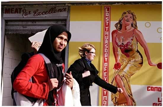 Actually I like this image it's a dramatic moment but I don't display it in public as many people are offended by it, to me it's about contrast of culture with three different woman, a Muslim, a busy career type, and a sexist poster. My intention is not racist or sexist.
I probably have more images that some people may find offensive or morally grey that I just keep in drawer.
 Such as the two images above.
 I like the way she's on her tip toes embracing him, it's just not very original.
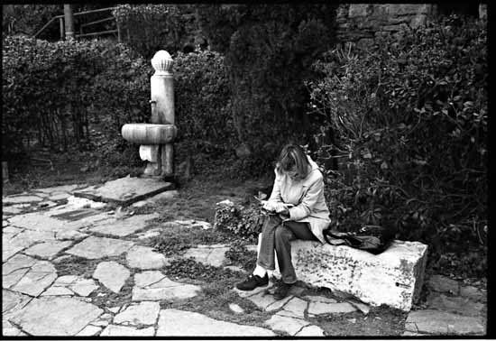
 I have a few man mimicking enviroment images already, I just don't know if there good enough.
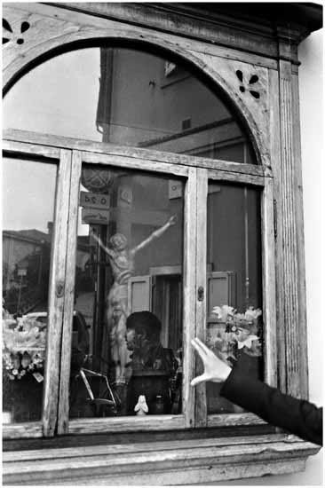
This one people might think I set up, but he was a tourist that I snapped when he was in conversation.
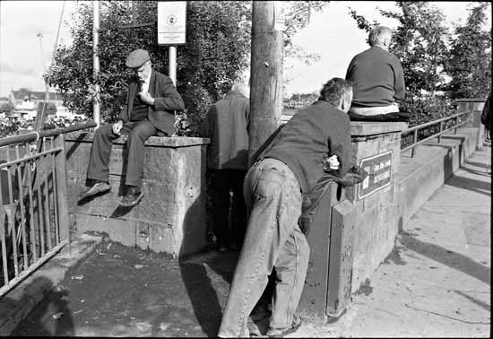
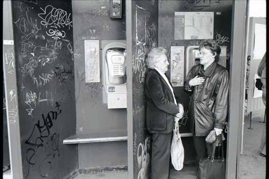 Meh I just don't know.
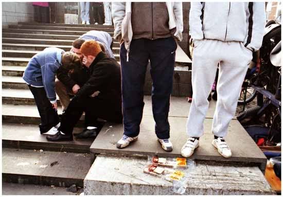 This I keep going back to this, maybe a bit too random
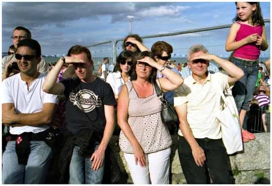
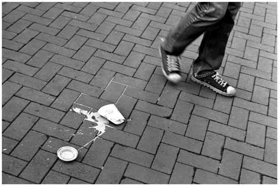
 The pope, Jesus, and santa clause, and two angry people. A very Irish scene, I like it but something holds me back from the darkroom and getting a print done.
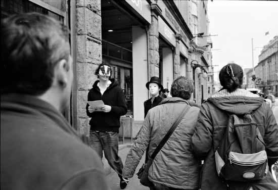 This as well.
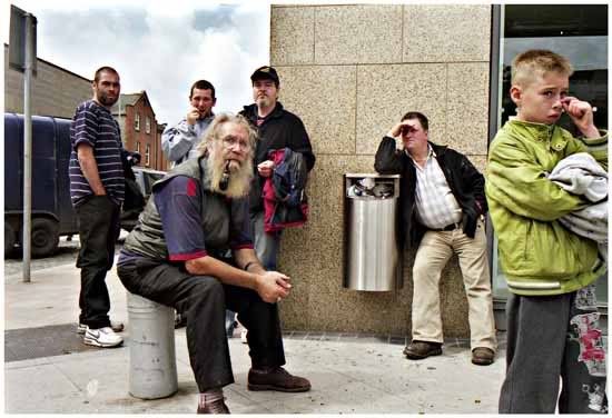 The same as this. Which I sort of think is okay but the rangefinder parralax error pisses me off, I saw more of the kid picking his nose in the viewfinder.
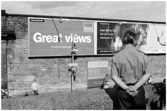 I have a gazzillion poster images, it seems just a bit of a cliche at this stage.
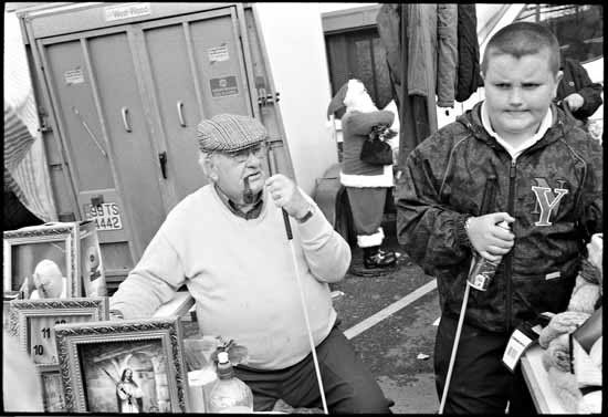
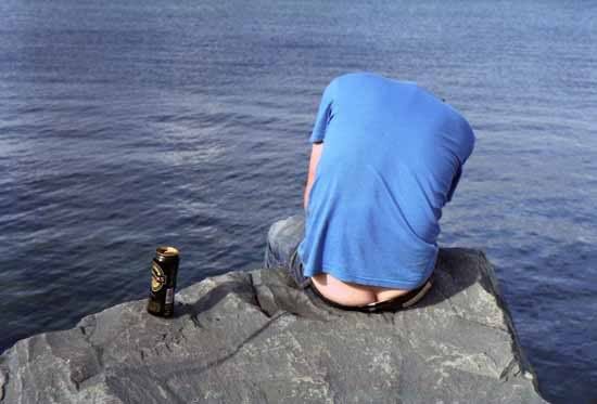 I have a similair image to this except in Black and White, although this could be the better version.
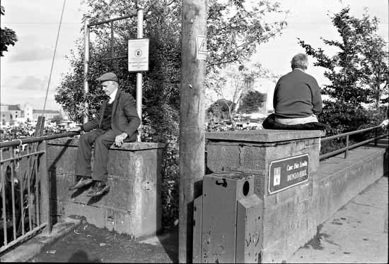
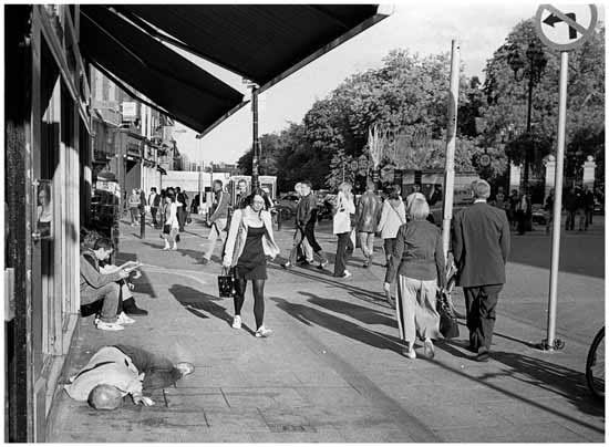
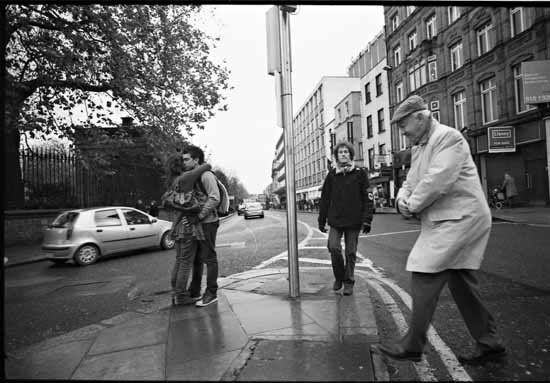
 These two really have me frustrated.
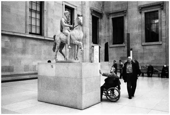 The two people walking behind the men in the foreground annoy me.
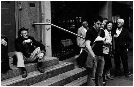
 One of the first photos from my 21mm Voightlander.
Well that's it for now, this is my first blog post since the death of uber, I haven't really been motivated to post anything recently. Also the death of Uber highlights the impermance of digital media versus analogue.
I could post hundreds more images that I'm undecided about, but any feedback would be apreciated, am I too picky?
I'll upload anouther set of rejected photos when I get back from London.
7 comments:
great shots, go on!!
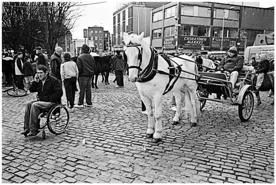
I think the horse/wheelchair photo is strong. You're just shooting what's there - people will form their own opinions, regardless.
think #1 is about the colors, nothing else though.
#2 (bum) offers too little
#3 has some humor, wheelchair vs horse cart vs mobile phone has an interesting contrast.
#4 is ok, but it doesn't offer much besides the kiss itself (in terms of contrast or geometry)
#5 is a good one again, woman and fountain form the same shape, it's interesting that it's not 2 ppl but 2 totally different things that create the same shape so .. like it!
#6 nice idea, just don't think it works that well. the woman's arms are kinda cut off, but not in the same way and the legs are more artifically cut .. so .. don't think i like it that much. also think it's a bit too busy.
#7 "ok" .. average, i'd say, neither bad nor particulary exciting
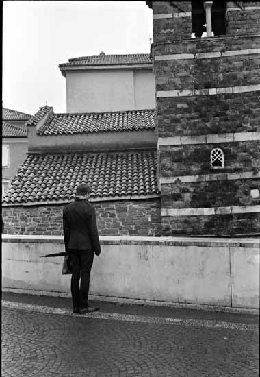
#8 pity the church horizontal is not straight, but good frame. the unusual pose of the man makes one wonder what he'll do next. has some mystery, so good photo!
#9 don't like that their feet are cut off and there's part of a woman on the right of the frame.
#10 guys with hands in their pockets make me wonder why they would stand like that facing you taking a photo of them .. so makes me wonder, which is good i think.
#11 too simple, dont like it
#12, 13 both offer me too little
#14 great how the guys all look kinda in your direction, all in a different pose. cut off leg is a shame.
#15 not a fan of these visual puns with ads in them, feels a bit cheap, but ok fram as long as you understand english (and i think a photo should work beyond that)
#16 lovely scene, drunk guy.
#17 prefer it over #18, #17 is better balanced
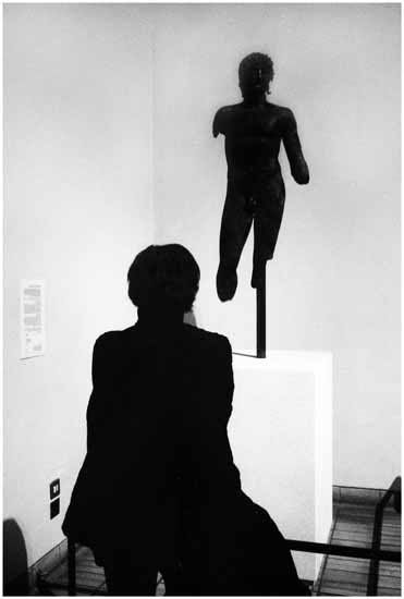
#18 guy with wheelchair touching the pedestal of the statue as if he'd stop in admiration .. good one
#19 nope. just a random guy and another one with a cut off leg. not good.
#20 so-so, too random imo
#21 nothing special
appreciate you don't want to spam your readers with one crap photo a day. i prefer to see an edited selection. as you said, there's enough bad photographs on the internet already. i'd prefer to see a few good ones every few week instead of lots of average ones weekly - makes the good ones disapprea in the mass of the photos.
and your scans suck as usual! luckily the photos are good so it doesn't matter :p loved the entry, would be glad to see such a nice selection some time again.
@ Sebastian: Many thanks for your honest and in depth critique, it is very much apreciated.
Sorry for not replying back sooner I was in London and without any internet for the past few weeks.
I'm my own worse critic too. I'm happy if I make one shot per roll that I like and most often it's not the one others would choose.
I don't feel 'qualified' to critique your work, Seamus, but I'll offer my thoughts on a few...
#1 (Img22_print) works for me. I see nothing offensive about it, maybe a bit careerist, but It's a good capture of life!
#3 (img492print) Similarly with this one. As a wheelchair user myself I have absolutely no problem with it and doubt others would. I have been abused in a pub for telling cripple jokes tho'! My second favourite shot. The other one is good too but I do see what you mean by the two people in the background.
#5 (ST007_print) Yes!
#8 (ST009) Talking to a brick wall. I like it. The window thingie up top is a little offputting for me.
#10 (Untitled-8_print) I like.
#12 (img852) Love the more you look the more you see.
#14 (img581) I like the different poses and expressions despite the parallax error.
#16 (img742print) My favourite. Looks like it would work better in colour than black and white.
#17 (img856) better than #18.
#20 (book1print) and #22 (ST072_print) I don't mind either. More slices of life.
Keep scanning, mate (something I should practise more often.) It's all good. Look forward to seeing more.
hey Seamus!
I met you on last Sunday on Henry street.
you did photographs with camera hasselblad.
I checked your profile on the website
http://treamus.deviantart.com/art
you have excellent photographs.
I will be visiting your blogger.
See you next time in the street :-)
You should never apologize or feel like you should defend your work. Some things may be controversial and some can be taken the wrong way, that's not the fault of the photographer, now is it? I think those photos are amazing (a couple made me laugh - not the wheelchair one, but others). You're there to capture the moment that others didn't see, and I think you do it very well :)
Post a Comment